Quick Checkout
Problem: How to add & add & add without adding complexity
With a large eCommerce site there is often a desire to keep adding features and functions, be it competitive/internal pressures or simply the passing of time. We often run into this choice paradox where providing more choices, more features does not help the customer with decision fatigue or even inspire confidence. Introducing Store Reservations to our shopping options added additional complexity to the already complex visual display, and in its worst case potentially introduces doubt around the choices. This was a test to see if combining functions into a drop-down menu beside the “add to cart” button would work as well as an additional button thus reducing the visual complexity of the interface. Surprisingly all respondents were able to understand there were additional purchasing options with the drop-down menu.
As is:
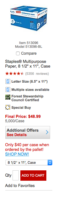
Purchasing from results pages, while good for efficiency, adds visual complexity to the product tile. There is a need to distinguish one product from the other or select the product while showing specific attributes such as: promotional marketing, site tools like the “compare” feature in addition to picture, name, and price.
Desired:
There was a need to better utilize our stores (Reserve & Pickup button)as well as a desire to offer a clearer checkout option (Checkout button). These additional functions increase the visual complexity and make the proximity of the actions that much further away from the photo.

What to try
It’s always good practice to explore a range of options. It’s a good business practice. However the reality is that knowing (experience) and really knowing (experimentation) are not interchangeable.
All buttons

While this worked it is a bit of an eyesore. Aesthetics aside... working is critically important... obviously
OR Links

This worked, however there was a noticeable pause before selection of the links and more so than just newness. The seeds of doubt were created trying to interpret the difference between links and buttons.
OR Checkout menu

This performed the worst. There was confusion as to why cart and checkout were not the same function. In academia this is a classic affordance issue where the expectations don’t follow or align.
OR Cart menu

The proclamation of "if I can’t see it, it doesn’t exist" is perhaps true, but in this case the nondescript little arrow performed as well as the all buttons.
What you learn
In this case we discover/rediscover that all functions do not need to be visible at all times. We also reaffirm some truths. One, breaking patterns and habits is really-really hard (the cart vs. checkout conundrum) and two, consistency and standards is really important (links vs. buttons and why).